
NAVIGATION OVERHAUL
Overview:
Silo’s original navigation was built specific to buying and selling roles in the produce distributor business. As the platform scaled to new product offerings… the navigation remained the same… and that needed to change. This work was a design-led initiative.
About Silo:
Silo is modernizing challenges through cloud software in the produce industry. Industry users are product distributors that come from decades old software or even pen and paper operations.
My role:
As a passion project, I raised awareness of navigation scalability issues and drove design execution.
Duration:
12-15 months from initial discussions to final release
Why update?
FOR SILO
As we move to a more modular strategy with our product offerings - there’s concern with bloating the real estate with our current navigation.
FOR USERS
Before it’s too late… we need to be more thoughtful of a more flexible experience and make it easier for users to get to what they need to.
KEY ISSUES
No sense of hierarchy or grouping similar features together while running out of horizontal space.
There’s a complete IA switch from sellers’s to buyer’s view that doesn’t make sense today (especially with other job roles at the business).
Accounting is a main product offering, and it hides under the user dropdown settings.
Let’s talk about
the journey
Raising awareness that there’s a problem
Getting buy-in to add this to the roadmap and getting users ready was key.
How we got aligned on the problem.
A lot of user feedback from every stage of the process from discussions on this topic to countless iterations to get their take.
Initial conversations in product and several brainstorm sessions with design, product and engineering leads.
How we planned to solve the problem.
A team was spun up to get this work onto the roadmap.
Keeping weekly syncs and dedicated slack channel to keep a pulse on users, stay in tight communication, and keep all teams and leadership informed.
Defining the design approach
We explored other navigation systems, explored what could work for our platform, and partnered with specific users along the way for feedback.
What we uncovered:
Keeping the visual distinction of buyer green and seller blue for ordering workflows is important for users who work overnight and early mornings.
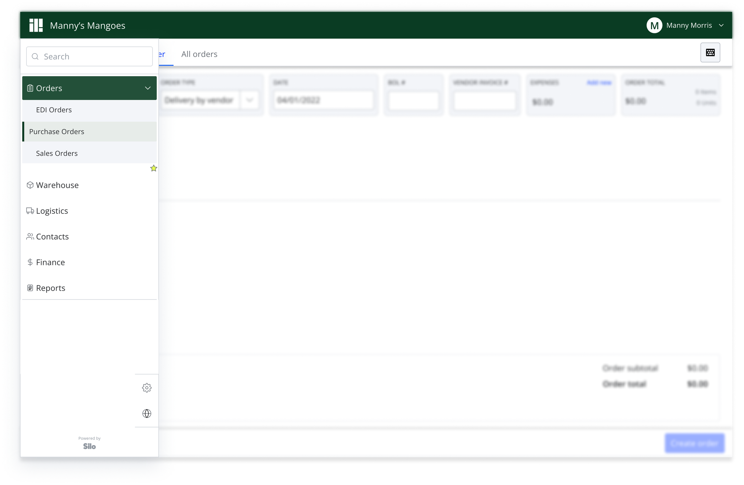
A few wanted to bookmark certain pages based on their job role. (ie. accounting, sellers, warehouse managers, etc.)
A lot of users rely on keystrokes (never use the mouse!), so we needed to define the right shortcuts and keyboard navigation.
Overall:
Users said they were fine with the changes as long as we didn’t remove current capabilities.
Getting into the design details
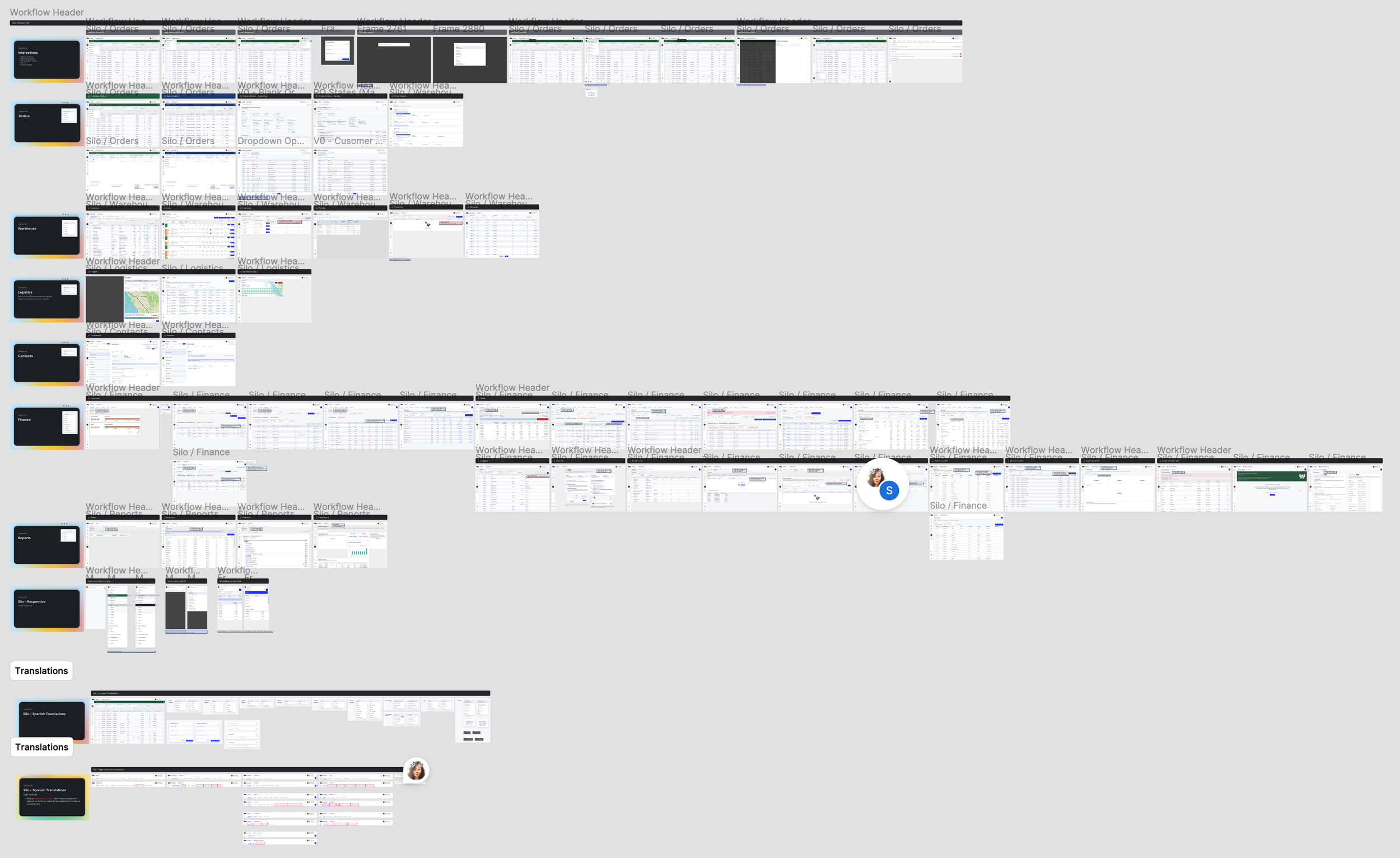
We now have a stronger approach to the design with all the iterations and feedback. Now it’s time to tackle the work across all pages in our platform and make sure it doesn’t break any workflows.
Change Management Plan
Sure there were users during research that seemed indifferent to the coming change, but we had high expectations they would be disgruntled once it went live.
Our users are old school and majority fall into an older demographic, so they are change averse. It took a lot of care to consider the best release approach with this in mind.
We also needed to be mindful of timing so our engineering team could maintain both navigation experiences without anything detrimental happening. Everyone needed to feel comfortable to officially remove the old code.
PHASE 1
Try out the modern layout
In-app onboarding experience via Appcues with a video of benefits and updates.
1 week
40%
Core users switched
to try the new navigation
PHASE 2
Switch all to modern layout
Switch all users to the modern layout that aren’t already on it with an Appcues update that we’re sunsetting the old one.
4 weeks
PHASE 3
Say goodbye to the old layout
Final Appcues update that the official switch is here, and users no longer have the option to revert back.
60%
Core users are using the new navigation at this phase
100%
Are officially switched.
No requests to switch back.
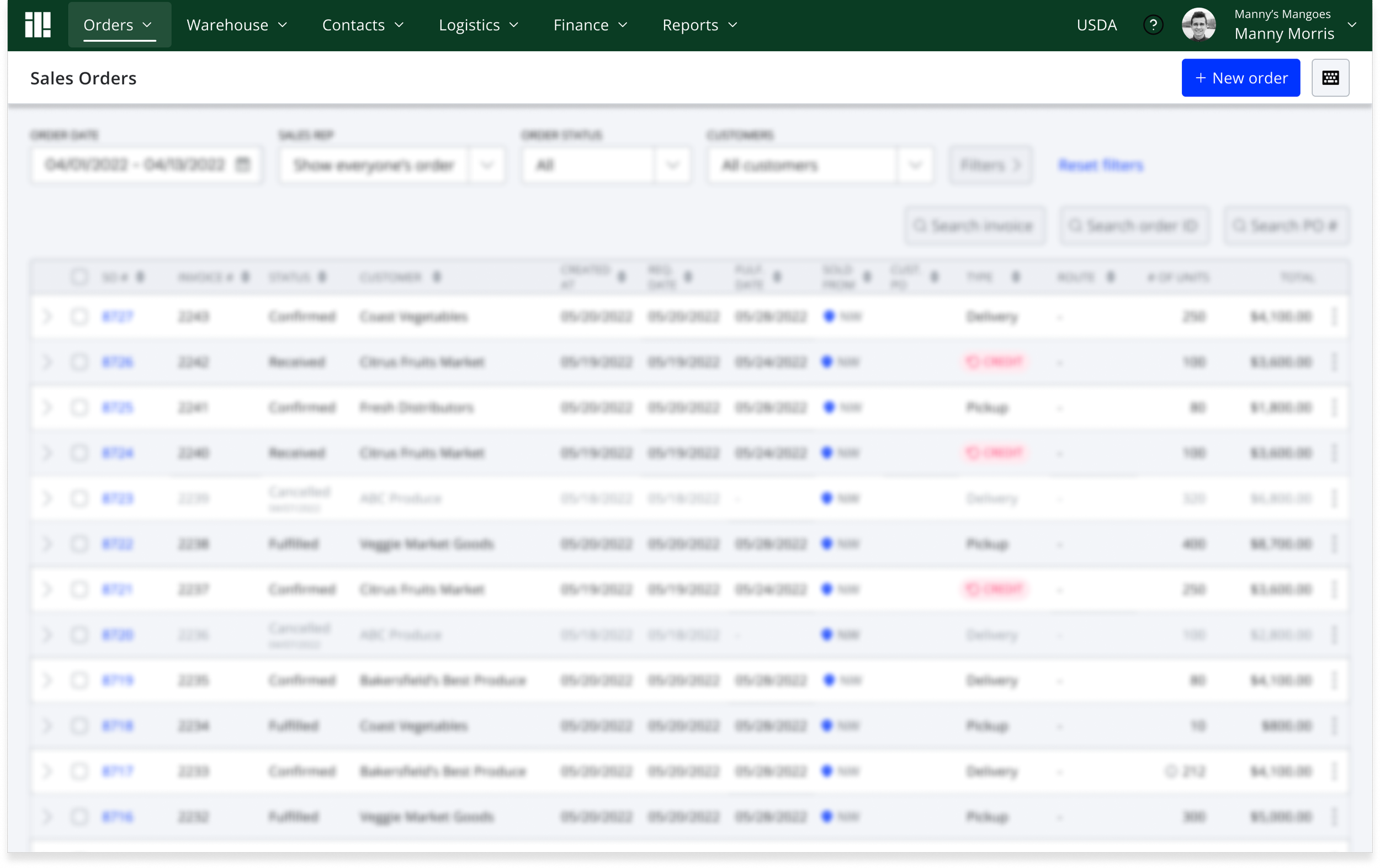
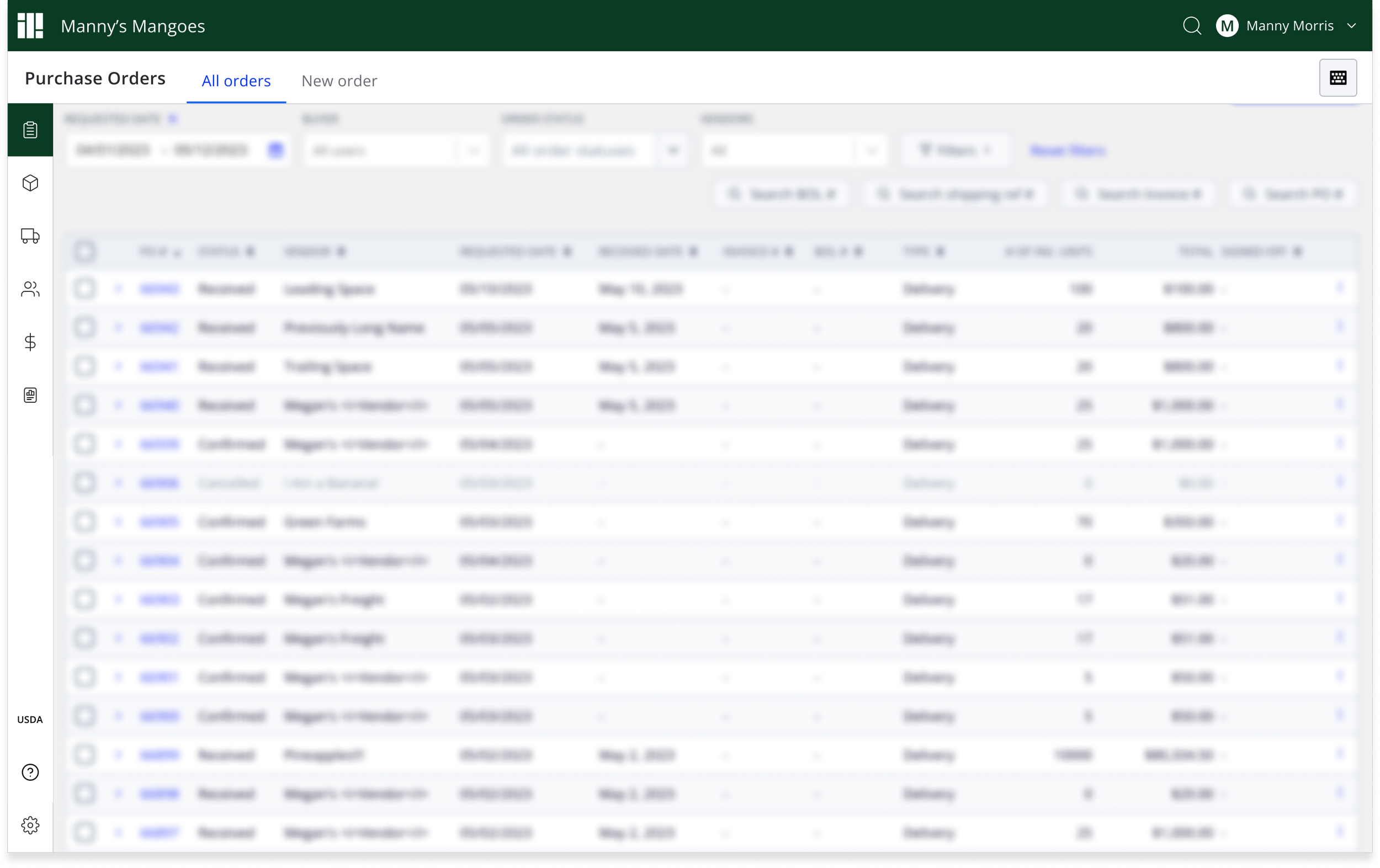
FINAL DESIGNS
Key improvements:
Favorites - quick access to the most used pages
Search - to find the page they are looking for faster
Reports & Finance - these are now fewer clicks to get to
Spanish translations - has been updated across all main page components
Responsive design - main nav components flex to smaller breakpoints like mobile
Keyboard navigation - edited to be more accessible-friendly and includes a shortcut to open search
Learnings
Overall, we were elated the work was done. It was a long journey, but we were able to release it without any users making requests to maintain the old navigation.
With the team
Why?
Figuring out how to organize our Finance features was an ongoing battle, and those product owners wanted a separate navigation
So what was the resolution?
It didn’t make sense to build a separate experience that engineering would have to maintain.
For now, we’ll fold Capital products under the Finance umbrella for now until we have a better direction of that product line.
With the work
This was a universal change, so as we built it, a lot of gnarly bugs were uncovered.
Like what?
Updating to ensure feature parity
Addressing different breakpoints
Localization for Spanish speaking users
With customers
Why?
Our users’ attitude was indifferent, but we know they are resistant to change.
So what was the game plan?
Kept users informed via email updates
In-product announcements
Sales and implementation kept up-to-date while onboarding new customers
Over-communication with customer success team
What’s next?
Coming out of this work, we recognized the need to tackle universal page level improvements next.
As this passion project was progressing, I was growing a design team. With the excitement of this work, the team was ready to take on more and continue to make universal improvements. I was able to hand off this next stage to other designers.
This would get defined in more detail within our design system and folded into product work.